The Mercator Map: Unraveling Its History, Distortions, And Enduring Use
Have you ever looked at a world map and wondered why some places, like Greenland, seem so incredibly huge? It's a common thought, you know. The chances are very good that the map you were looking at was a Mercator map. This particular map projection has shaped how many of us see our planet for centuries, yet it holds some fascinating secrets and, well, some rather big visual tricks. It's truly a product of its time, designed with a very specific purpose in mind.
This map, introduced by the Flemish cartographer Gerardus Mercator way back in 1569, became a standard for a very good reason. It was, in a way, a revolutionary tool for sailors and explorers during a time when new geographic information was pouring in from all corners of the world. Trade routes were being established, and people needed a reliable way to plot their courses across vast oceans. So, it really served a crucial role in that era.
However, despite its incredible usefulness for sea travel, the Mercator map isn't quite the true representation of our world's landmasses that many might assume. It has some distinct characteristics that cause certain distortions, especially when you look at areas far from the equator. Learning about this map, its history, and its quirks can actually change how you perceive the globe.
Table of Contents
- What is the Mercator Projection?
- A Look Back: The Origins of the Mercator Map
- Why the Mercator Map Became So Popular
- The Mercator Map's Unique Features
- The Great Distortion: Understanding Scale Issues
- Practical Uses and Limitations Today
- Exploring Alternatives to the Mercator Projection
- The Math Behind the Map
- Common Questions About the Mercator Map (FAQ)
What is the Mercator Projection?
The Mercator projection, you see, is a specific way of taking our spherical Earth and flattening it onto a two-dimensional surface. It's a conformal cylindrical map projection, which sounds a bit technical, but it simply means it wraps the globe onto a cylinder, then unrolls it. This method, introduced by Gerardus Mercator in 1569, was a big deal for its time. It was originally created, apparently, to help display accurate compass bearings for sea travel.
This map projection is, in a way, very widely used even today for things like navigation and web maps. However, it also has a well-known characteristic: it distorts the size of landmasses, especially those that are closer to the Earth's poles. So, while it's super useful for some things, it doesn't give you a truly accurate sense of how big countries really are in relation to each other.
A Look Back: The Origins of the Mercator Map
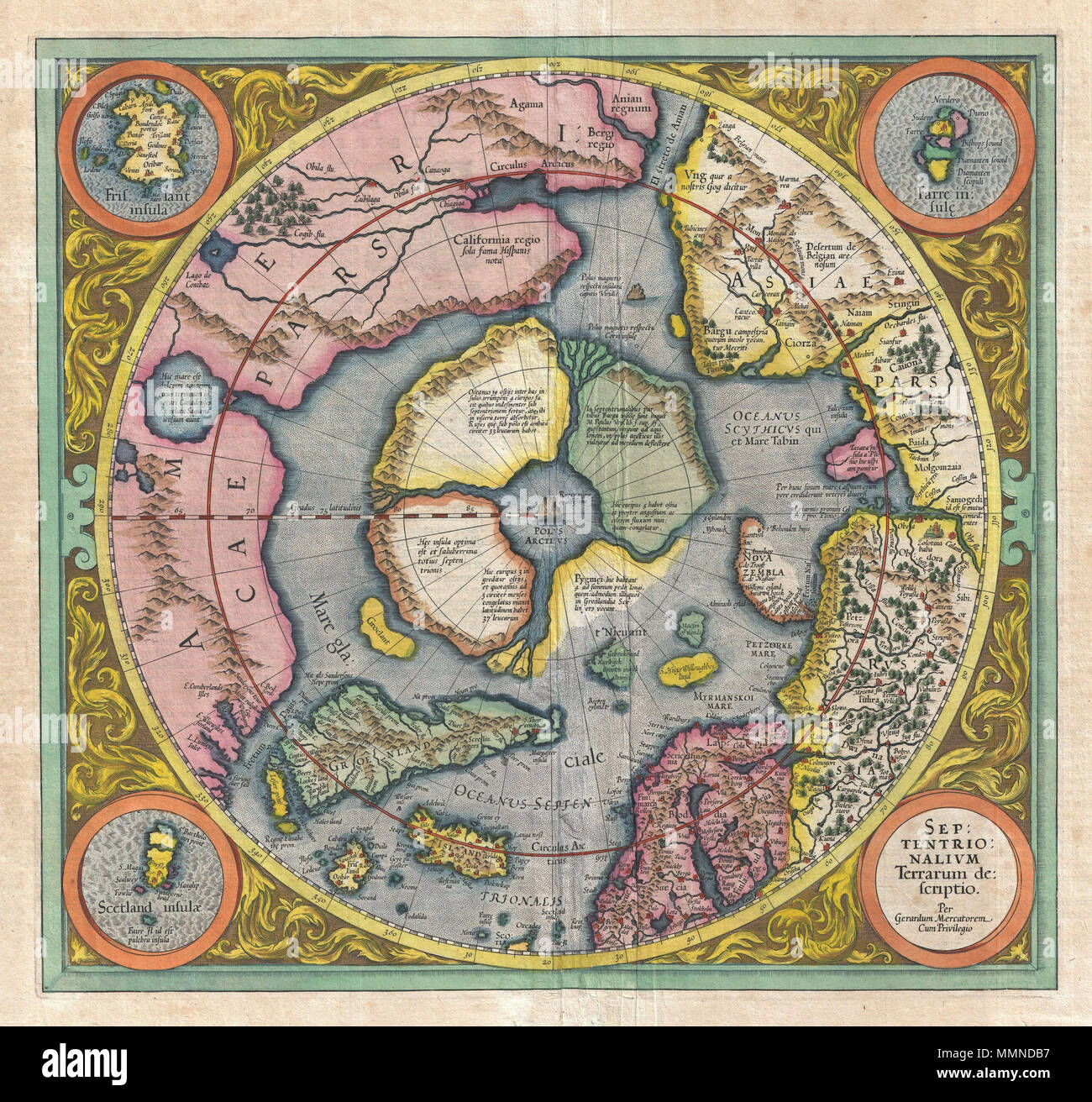
The story of the Mercator map begins with a Flemish cosmographer and cartographer named Gerardus Mercator. He presented this cylindrical map projection in 1569. This was a time, in the sixteenth century, when new geographic information was just pouring in from around the world, and trade routes were really taking shape. Sailors and explorers, you know, needed better tools.
Mercator's 1569 map itself was quite an undertaking. It was a very large planisphere, which means it was a projection of the spherical Earth onto a flat surface. This huge map was printed in eighteen separate sheets, apparently from copper plates that Mercator himself engraved. Each sheet measured about 33 by 40 centimeters, and with a border of 2 centimeters, the complete map was a substantial 202 by 124 centimeters. All sheets spanned a longitude of 60 degrees, and the first row of 6 sheets covered latitudes from 80° North to 56°. This map, in a way, was quite a masterpiece of its era.
Why the Mercator Map Became So Popular
Without a doubt, the Mercator projection became the most famous map projection. In fact, it was the very first projection regularly identified in atlases, which is pretty significant. Its popularity wasn't just by chance; it was a direct result of its unique properties that greatly simplified ocean navigation.
The key feature that made it so widely used for nautical purposes was its ability to represent lines of constant course, also known as rhumb lines or loxodromes, as straight segments. This meant that a straight line drawn on a Mercator map indicated a straight course for a ship, which was incredibly helpful for sailors trying to maintain a consistent bearing across vast distances. This simplification was, you know, a game-changer for maritime travel.
The Mercator Map's Unique Features
Preserving Angles and Directions
One of the most remarkable features of the Mercator projection is its ability to preserve angles. This means that directions and angles are maintained at an infinitesimal scale. If you look at a small area on the map, the shapes of local features are accurate and correctly defined. This characteristic is why it's called a "conformal" projection.
For sailors, this was extremely useful because it meant their compass bearings translated directly onto the map. A straight line on the map meant they could follow a constant compass direction, making sea travel much more straightforward. So, it was, in a way, a very practical tool for plotting courses.
Conformal and Cylindrical Design
As mentioned, the Mercator projection is a conformal cylindrical map. The "cylindrical" part refers to the idea of wrapping a cylinder around the globe, usually touching the equator. Then, the Earth's features are projected onto this cylinder, and the cylinder is unrolled to create the flat map.
The "conformal" aspect means that it preserves shapes locally, and angles are true. While this is great for navigation, it's also the very reason why it causes distortion in other areas. It's a bit of a trade-off, you see, between preserving angles and preserving true area.
The Great Distortion: Understanding Scale Issues
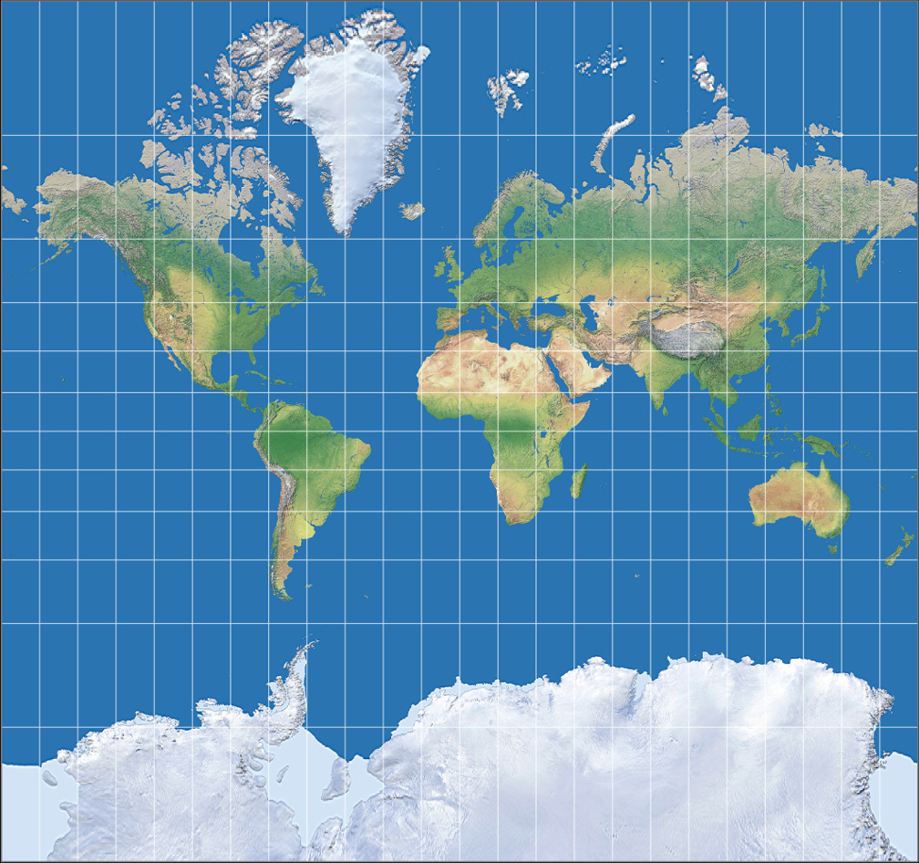
Despite its usefulness for navigation, the Mercator projection is not a practical world map for showing the true size of countries. It distorts the size of landmasses, especially as you move farther away from the equator. This is, you know, a pretty significant criticism of the map for general use.
This distortion is a side effect, some might say a eurocentric one, where objects appear drastically inflated in size the farther they are from the equator. This means landmasses like Europe, North America, and Antarctica seem much larger than they actually are in reality. It's quite a visual trick, isn't it?
Greenland vs. Africa: A Visual Surprise
A classic example of this distortion is the comparison between Greenland and Africa. On a Mercator map, Greenland often appears to be roughly the same size as Africa, or perhaps even larger. But is Greenland really as big as all of Africa? You may be surprised at what you find when you look at a more accurate projection.
In reality, Greenland is significantly smaller than Africa. In fact, Greenland, apparently, is 16 times larger on Mercator's projection than it is in reality. There are clever graphics and interactive tools online that help put into perspective the true size of countries. You can even drag and drop countries around the map to compare their relative size. This can be a great tool for educators, too, showing just how much the map distorts.
Landmasses Near the Poles
In the Mercator projection, landmasses such as Greenland, Antarctica, Canada, and Russia appear far larger than they really are. This is especially true when you compare them relative to landmasses near the equator, such as Central Africa and the Antilles. Countries close to the equator barely change in apparent size, whereas countries further north or south shrink dramatically in actual size compared to their Mercator representation.
There are, you know, maps that show this distortion very clearly. Some even have animations where a country 'shrinks' to its actual size or 'grows' to the size shown on the Mercator projection. This kind of visual aid really helps people grasp the extent of the distortion.
Practical Uses and Limitations Today
Navigation and Web Maps
Despite its distortions, the Mercator projection remains incredibly useful for specific applications. It became the standard map projection for ocean navigation, and it still is, in a way, very much in use. Its ability to represent lines of constant course as straight segments is simply invaluable for plotting routes at sea.
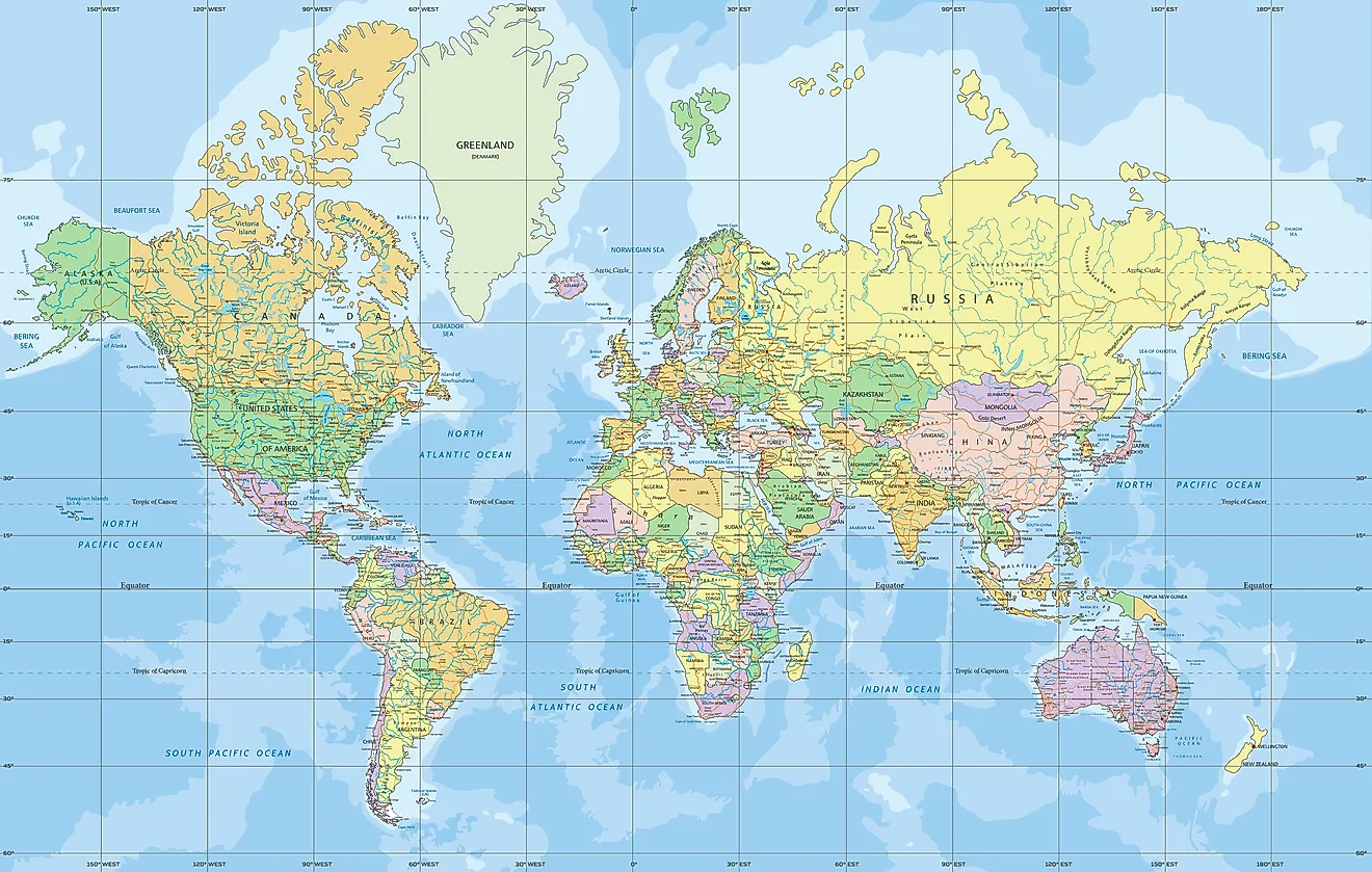
Beyond traditional navigation, the Mercator projection also finds widespread use in modern web map services, like those you use on your phone or computer for street maps. Its conformal property, which preserves local shapes and angles, makes it quite suitable for street-level views where local accuracy is more important than global area accuracy. Find out how Mercator projection is used for navigation and street map services.
Not a World Map for True Size
While it's a useful navigation tool, a straight line on a Mercator map indicates a straight course, but it is not a practical world map for general purposes. This is because of the significant distortion of scale near the poles. If you want to understand the true relative sizes of countries, you know, this is not the map to use.
The common perception that "the world map you know is totally wrong" often refers to the Mercator projection's misrepresentation of landmass sizes. It's important to remember its original purpose and its limitations when viewing a world map.
Exploring Alternatives to the Mercator Projection
Given the Mercator map's distortions, especially concerning the size of landmasses, many other map projections have been developed over time. The number of map projections made possible is, you know, practically limitless, and hundreds have been published throughout history. These alternatives aim to reduce distortion and offer a more accurate representation of the Earth's surface, particularly in terms of area.
Exploring these alternatives can offer a very different perspective on our world. Maps like the Gall-Peters projection, for instance, aim to show the correct relative sizes of countries, though they might distort shapes. Other projections try to find a balance between preserving area, shape, distance, and direction, because, in a way, no flat map can perfectly represent a sphere without some compromise.
The Math Behind the Map
The Mercator projection isn't just a simple drawing; it's based on some rather clever mathematics. To achieve its unique properties, like preserving angles and representing rhumb lines as straight lines, the projection involves complex calculations. It relates to logarithms and trigonometric functions, which help to systematically expand the distances between lines of latitude as they move away from the equator.
This mathematical foundation is what allows the map to maintain local shapes and directions so accurately, even while it stretches out areas closer to the poles. It's a testament to Mercator's ingenuity that he developed such a mathematically sound projection in the 16th century. For those interested, there are many resources that explore the math behind the map in more detail, perhaps on a well-known cartography resource like Britannica.
Common Questions About the Mercator Map (FAQ)
Why does Greenland look so big on maps?
Greenland appears much larger on a Mercator map because of the projection's inherent distortion. This map stretches out areas as they get further from the equator to keep angles correct for navigation. Since Greenland is very far north, its size gets significantly exaggerated, making it seem, you know, disproportionately massive compared to its actual area.
Is the Mercator map wrong?
The Mercator map isn't "wrong" in terms of its intended purpose; it's just not a general-purpose world map. It was designed to simplify navigation by preserving angles and making constant compass bearings appear as straight lines. For showing the true relative sizes of landmasses, however, it is quite inaccurate due to the distortion of scale near the poles. So, it's more about its specific use rather than being universally correct or incorrect.
What are the main criticisms of the Mercator projection?
The primary criticism of the Mercator projection is its significant distortion of the size of landmasses, especially those far from the equator. Countries like Canada, Russia, and Greenland appear much larger than they truly are, while equatorial regions like Central Africa seem comparatively smaller. This can lead to a skewed perception of the world's geography and the relative importance of different regions. Learn more about the Mercator map on our site.
Mercator map 1569 hi-res stock photography and images - Alamy
License Info: Mercator
World Map - Mercator Projection - WorldAtlas
